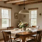
Redesigning your dining room can be a fulfilling project. It’s the heart of your home, where family and friends gather over meals and memories. If you’re looking to create a peaceful and inviting space, choosing the right paint color is essential. With so many options out there, it can feel overwhelming. That’s why I put together this guide featuring 10 dining room paint color ideas that feel calm and timeless.
If you’re someone who appreciates cozy home decor and desires a serene atmosphere for dining, this post is for you. Whether you’re a seasoned interior decorator or just starting to explore your style, these color ideas cater to a variety of tastes. You’ll discover shades that not only enhance your dining space but also contribute to a calming environment.
By the end of this post, you’ll have a list of ten beautiful colors, along with tips on how to incorporate them into your dining room. Each color is selected for its ability to create a peaceful dining atmosphere, ensuring your space feels inviting for every meal. Let’s dive in!
Key Takeaways
– Explore 10 serene paint colors that can help you create a calm and timeless dining room atmosphere.
– Discover how dining room color schemes play a vital role in enhancing your home decor.
– Learn about calming paint colors that promote relaxation and comfort during meals.
– Get practical tips on implementing these interior paint ideas for a cohesive look.
– Understand how the right colors can lead to a more peaceful dining atmosphere, perfect for family gatherings and special occasions.
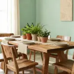
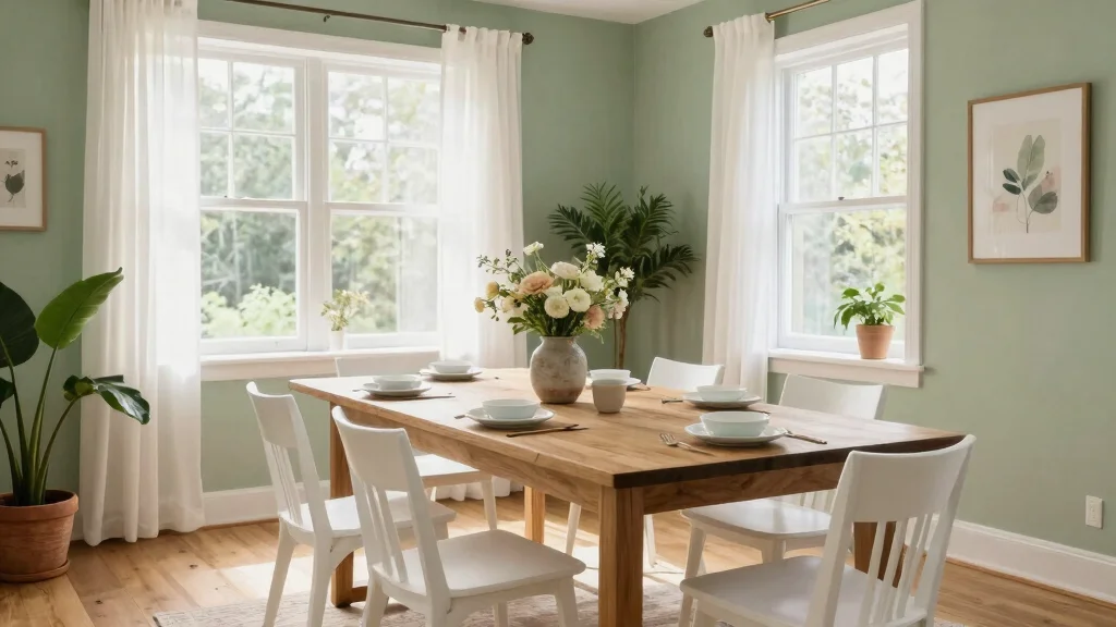
1. Soft Sage Green

Soft sage green brings a refreshing touch of nature into your dining room, creating a peaceful and inviting space. This gentle hue effortlessly evokes the tranquility of a lush garden, making it perfect for fostering warm conversations and togetherness. It pairs beautifully with natural wood accents and crisp whites, allowing for versatile styling that suits both modern and rustic aesthetics. With the right balance, sage green transforms your dining area into a calming retreat for meals and gatherings.
To enhance this soothing palette, consider using eco-friendly paint options to maintain a healthy environment. Incorporating plants into your decor can further amplify the organic feel, bringing life and texture into the space.
Consider these ideas to elevate your dining room with sage green:
– Pair sage green walls with white crown molding for added elegance.
– Install open shelving in natural wood to showcase dishes and decor.
– Use woven baskets for storage that complements the green tones.
This approach not only enhances the overall aesthetic but also brings in natural textures that create a harmonious atmosphere.
Soft Sage Green
Editor’s Choice


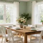
2. Tranquil Blue

Tranquil blue creates a serene and calming atmosphere that invites relaxation into your dining space. This soothing color works harmoniously with both light and dark wood furniture, providing a serene backdrop for meals shared with friends and family. The soft shades of blue mimic the sky and ocean, evoking feelings of openness and tranquility, making each dining experience feel more refreshing. Opting for low-VOC, eco-friendly paints ensures that your home remains a peaceful sanctuary.
To make the most of tranquil blue, consider pairing it with soft whites or creams for a classic and timeless look. Adding textures through table linens or wall hangings can create visual interest and depth, enhancing the calming effect of the color.
Here are some practical tips to implement this color:
– Pair tranquil blue with white dishes for a crisp, clean table setting.
– Incorporate soft textiles like linen napkins for added comfort.
– Use warm accent colors, such as soft yellows, to brighten the space.
This thoughtful approach allows you to create a balanced environment that feels both welcoming and expansive.
3. Warm Taupe

Warm taupe is an inviting choice for those seeking a neutral palette with rich undertones that radiate comfort. This versatile color brings a cozy atmosphere to your dining room, ideal for intimate gatherings and shared meals. Taupe pairs beautifully with both bold and muted decor, allowing you to easily mix and match with various color schemes. Choosing eco-friendly paint options adds to the overall healthiness of your living space.
To maximize taupe’s potential, consider using it with darker accents, like deep teal or forest green, for a sophisticated contrast. Incorporating natural textures, such as woven baskets or wooden decor, can enhance the earthy feel of taupe while adding depth.
Try these ideas to beautifully implement taupe in your dining room:
– Use taupe walls as a backdrop for vibrant artwork.
– Install pendant lighting to create a warm, inviting glow.
– Add soft textiles like a cozy tablecloth for a touch of comfort.
This combination brings warmth and elegance, making your dining space feel inviting and stylish.
Key Trade-offs & Our Top Pick
Option 1: Soft Sage Green
– Pros:
– Creates a refreshing and serene atmosphere.
– Pairs well with natural materials like wood and stone.
– Cons:
– Might feel too bold for very small dining spaces.
– Can clash with warmer wood tones.
– Best for: Those wanting a nature-inspired, calming vibe in a larger dining room.
Option 2: Tranquil Blue
– Pros:
– Evokes feelings of peace and relaxation.
– Works well in both modern and traditional settings.
– Cons:
– May appear cold in poorly lit rooms.
– Requires careful selection of complementary decor.
– Best for: Homes that favor cool color palettes and want a soothing environment during meals.
Option 3: Warm Taupe
– Pros:
– Provides a cozy and inviting feel.
– Versatile, blending with many dining room color schemes.
– Cons:
– Can become dull if paired with the wrong accent colors.
– Might not be suitable for very bright spaces as it can make them feel darker.
– Best for: Anyone seeking a warm, timeless look that is easy to coordinate with furniture.
Option 4: Pale Blush
– Pros:
– Adds a soft, romantic touch to the dining room.
– Enhances natural light, making spaces feel airy.
– Cons:
– Can appear too light or washed out in bright areas.
– May require frequent touch-ups due to wear and tear.
– Best for: Those who love gentle, understated colors and want a fresh look.
Expert Recommendation:
Best Overall: Warm Taupe
Warm Taupe is an excellent choice for most people. It strikes a balance between warmth and versatility, making it easy to pair with various decor styles. The color is durable and works well in diverse lighting conditions, ensuring your dining room remains inviting and timeless throughout the day.
Why We Picked This:
We understand that everyone’s taste is unique. If you prefer something more vibrant, Soft Sage Green or Tranquil Blue might suit you better. For those who lean toward softer shades, Pale Blush could be ideal. Each option has its charm, so consider what atmosphere you’re trying to create. Happy decorating!
4. Pale Blush

Pale blush introduces a soft, romantic touch to your dining room, creating a dreamy and inviting atmosphere. This delicate shade adds warmth without overwhelming the senses, making it perfect for calm and elegant dining experiences. It pairs beautifully with white and gold accents, enhancing the overall aesthetic while maintaining a relaxed vibe. Opting for eco-friendly options in this palette supports a sustainable choice for your home.
To create a stunning blush-inspired dining space, use this color as a backdrop for vibrant decor elements, such as bold table centerpieces or colorful artwork. Incorporating soft textiles like pastel tablecloths or throw pillows can further emphasize the soothing nature of blush.
Here are a few ideas to enhance your dining room with pale blush:
– Use blush as a subtle backdrop for striking wall art.
– Incorporate soft linens to add texture and comfort.
– Apply a matte finish to reduce glare and soften the overall look.
This approach not only enhances the romantic feel but also creates a cozy dining experience for you and your guests.
Fun fact: Pale blush can visually widen a dining room, making your dining room paint color ideas feel calmer and more inviting. Pair it with white and gold accents for elegance, and choose eco-friendly paints to keep your space beautiful and sustainable.
Pale Blush
Editor’s Choice


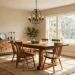
5. Soft Gray

Soft gray is a timeless choice that brings sophistication and calmness to your dining area. This versatile shade serves as a neutral backdrop, allowing you to layer textures, patterns, and colors to create a personalized and inviting space. Gray complements nearly every style, from modern minimalist to classic chic, making it a highly adaptable option for your dining room. Choosing eco-friendly paint ensures that your serene sanctuary promotes health and well-being.
To create a striking dining room with soft gray, pair it with deep navy or rich burgundy for a bold contrast that adds depth. Incorporate textured fabrics, such as silk or linen, in your table settings to add dimension without overwhelming the calm atmosphere.
Here are some practical tips for using soft gray:
– Pair gray walls with wooden accents for warmth.
– Use varying light sources to create an inviting glow.
– Add vibrant tableware to contrast with the softness of gray.
This thoughtful approach enhances the overall aesthetic while maintaining a tranquil and stylish environment.
6. Creamy Off-White

Creamy off-white is a classic choice that brings an airy, light-filled quality to your dining room. This gentle hue reflects light beautifully, making even smaller spaces feel larger and more welcoming. Off-white pairs seamlessly with almost any color, offering flexibility in accent decor and furniture choices. Opting for eco-friendly versions ensures that you maintain a healthy environment while enjoying a timeless aesthetic.
To create a stunning dining space with creamy off-white, use this color on walls alongside darker wooden furniture for a classic contrast that feels fresh. Consider incorporating textured accessories, such as a woven table runner or linen napkins, to enhance visual interest within a calm palette.
Here are some ideas to maximize the impact of off-white:
– Layer off-white decor with rich textiles for depth.
– Add warm lighting to highlight the soft tones.
– Use colorful dishes to bring life to a subtle backdrop.
This combination not only brightens the space but also creates a serene and inviting dining atmosphere.
For dining room paint color ideas, creamy off-white feels timeless and easy to work with. It reflects light beautifully, making small spaces feel bigger, and eco-friendly options help you stay healthy while you style.
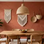
7. Earthy Terracotta

Earthy terracotta infuses warmth and a grounded feeling into your dining room, making it an ideal backdrop for cozy family meals. This rich, earthy tone evokes a sense of nature and comfort, allowing you to create a welcoming atmosphere. Terracotta pairs beautifully with natural woods and greens, seamlessly blending indoor and outdoor vibes. Choosing eco-friendly paints helps maintain a sustainable approach to home decor while enjoying the timeless allure of this hue.
To enhance the beauty of terracotta, combine it with cream or beige to soften the look and enhance its warmth. Adding decorative pottery or woven textiles can highlight the color’s rustic nature, creating a harmonious space.
Consider these ideas to incorporate earthy terracotta:
– Use terracotta as a focal point with statement decor.
– Incorporate natural elements like plants for added warmth.
– Opt for warm lighting to elevate the inviting ambiance.
This thoughtful approach creates a cozy environment perfect for gatherings and meals with loved ones.
Earthy Terracotta
Editor’s Choice


8. Misty Lavender

Misty lavender offers a unique twist on calming colors, introducing a hint of playful elegance to your dining space. This soft hue adds a dreamy quality to your room, invoking feelings of tranquility and creativity. Lavender pairs beautifully with whites and soft greens, allowing you to create a refreshing atmosphere that feels both relaxing and stimulating. Choosing eco-friendly paint options ensures your choice is sustainable while radiating a peaceful environment.
To make the most of misty lavender, use it as a backdrop for botanical prints or artwork that enhances the color scheme. Incorporating soft lighting, such as hanging pendant lights, can highlight the ethereal quality of lavender, creating depth in the room.
Here are some practical tips to elevate your dining room with lavender:
– Use lavender walls as a backdrop for bright accents.
– Incorporate various textures to enrich the space.
– Add layers of soft lighting to enhance the dreamy effect.
This approach not only enhances the overall aesthetic but also creates a peaceful and inspiring dining environment.
Misty Lavender
Editor’s Choice


9. Gentle Mint

Gentle mint is a refreshing color that brings a sense of calm and freshness to your dining room. This soft greenish hue radiates positivity and pairs wonderfully with a variety of decor styles, from modern to vintage. Gentle mint enhances natural light, creating a bright and airy atmosphere that invites relaxation and conversation. Choosing eco-friendly paint options allows you to maintain a healthy environment while enjoying a beautiful aesthetic.
To beautifully implement gentle mint, pair it with crisp whites for a clean, modern look that feels refreshing. Using natural wood elements can enhance the fresh feeling in the room, creating a balanced and inviting space.
Here are some ideas to incorporate gentle mint:
– Use mint as an accent wall to create a focal point.
– Incorporate decorative dishes that feature mint tones.
– Add fresh greenery to enhance the vibrant atmosphere.
This thoughtful approach allows you to create a cheerful dining environment that feels both lively and welcoming.
Fun fact: choosing gentle mint as part of your dining room paint color ideas can boost natural light and freshness by up to 40%, making conversations flow easier. Pro tip: pair eco-friendly paints with lighter furniture for a brighter, calmer, timeless space.
10. Dusty Rose

Dusty rose is a soft, muted hue that brings an air of elegance and warmth into your dining space. This color introduces a subtle touch of romance, making it perfect for family dinners or special celebrations. Its versatility allows it to blend seamlessly with various decor styles, enhancing the overall ambiance of your dining room. Choosing eco-friendly options enhances the sustainable aspect while promoting a calming environment.
To create a chic dining room with dusty rose, pair it with darker shades like charcoal or navy for a stunning contrast that elevates the overall look. Using elegant textures in table settings, such as lace or silk, can enhance the romantic atmosphere while making the space feel inviting.
Here are some ideas to implement dusty rose:
– Use dusty rose as a wall color to set a romantic tone.
– Incorporate soft table linens to add a touch of sophistication.
– Utilize warm lighting to enhance the muted tones for a cozy dining experience.
This approach creates a beautiful and inviting atmosphere, making every meal feel special.
Dusty Rose
Editor’s Choice


Conclusion

Finding the perfect paint color for your dining room can create a calm and timeless atmosphere that enhances your meals and gatherings.
Each color choice offers its unique charm, reflecting both style and tranquility. By incorporating eco-friendly options, you can achieve a beautiful space while remaining conscious of the environment. From soft sage green to dusty rose, these dining room paint color ideas help evoke a peaceful ambiance that fosters connection and joy around the table. Choose the shade that resonates with you and enjoy the transformation of your dining space.
Note: We aim to provide accurate product links, but some may occasionally expire or become unavailable. If this happens, please search directly on Amazon for the product or a suitable alternative.
This post contains Amazon affiliate links, meaning we may earn a small commission if you purchase through our links, at no extra cost to you.
Frequently Asked Questions
What are the best eco-friendly dining room paint color ideas that feel calm and timeless?
Choosing eco-friendly options means looking for low-VOC or zero-VOC paints, water-based formulas, and sustainably produced pigments. For dining room paint color ideas, start with calming paint colors that pair well in any dining room color schemes. Try soft sage green, warm greige, creamy almond, and pale blue; they create a peaceful dining atmosphere without feeling clinical. Practical steps: choose a base neutral in a durable finish like eggshell or satin; confirm the product is low-VOC; test swatches on multiple walls under natural and artificial light; choose a finish that is easy to wash for everyday dining. These interior paint ideas help your space stay timeless.
How can I choose calming color schemes for a dining room while staying green?
Start with a neutral foundation and bring in natural textures like wood, linen, and plants to ground the palette. In terms of dining room color schemes, pair a warm white or soft greige with a gentle green or blue accent wall to evoke a peaceful dining atmosphere. Use eco-friendly paints and avoid clutter, letting a single, well-chosen color anchor the room for a timeless home decor feel. Tip: accessorize with sustainable materials to extend the calm beyond paint.
Which finishes and strategies help timeless colors stay fresh in a dining room?
Go with washable finishes such as eggshell or satin to keep walls easy to clean after meals. Use a quality primer to prevent stain bleed and to ensure the color remains true longer. Choose durable interior paint ideas pigments that resist fading in natural light. If you’re repainting existing walls, consider a tinted primer to maintain the calming paint colors you love. For an eco-friendly edge, look for paints with low odor and minimal off-gassing.
What tips help a small dining room or north-facing room use calming colors without feeling cramped?
Light, warm neutrals reflect more light and can visually expand the space. Paint the ceiling a shade lighter than the walls to create the illusion of height, and keep furniture slim and transparent where possible. Consider an accent wall in a soft, eco-friendly color to anchor the room without crowding it. Use a mirror or glass-dominant pieces to reflect light, enhancing the peaceful dining atmosphere. All of this supports a timeless home decor vibe even in a compact area.
How can I maintain an eco-friendly, calming dining room after painting?
Prioritize gentle cleaning with microfiber cloths and mild, environmentally friendly cleaners. Save on paint by doing small touch-ups with leftover or sample pots instead of repainting whole walls. Select long-lasting, washable finishes to reduce frequent repaints and waste. Keep the space alive with natural textures, greenery, and soft lighting to maintain the dining room paint color ideas vibe and the peaceful dining atmosphere long-term. Regularly ventilate during and after painting to minimize VOC buildup and ensure healthy indoor air.